Why Most Landing Pages Fail
The average landing page conversion rate is 2.35%. The top 25% convert at 5.31%+. The difference? Design decisions that guide visitors toward one single action.
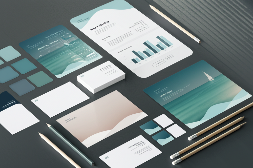
At ANF STUDIO, we've designed and tested hundreds of landing pages for D2C brands, SaaS products, and service businesses. Here are the 7 secrets that separate high-converting pages from the rest.
1. One Page, One Goal
The #1 rule of landing pages: remove all distractions.
- No navigation menu: Don't give visitors a way to leave
- One CTA: Every element should point to the same action
- Remove footer links: Minimize exit opportunities
- No sidebar: Full-width, focused layout
2. The Hero Section Formula
You have 3 seconds to hook visitors. Your hero needs:
#
The Headline
Use the PAS formula:- Problem: "Tired of low-converting Shopify ads?"
- Agitation: "You're spending ₹50K/month with nothing to show for it"
- Solution: "We build ad funnels that deliver 4x ROAS — guaranteed"
- "Get 3x More Shopify Sales in 90 Days"
- "Professional Invoices for Every Order — Automated"
- "Launch Your D2C Brand in 2 Weeks"
The Sub-headline
One sentence expanding on the headline. Address the "how" briefly.#
The CTA Button
- Use action words: "Get Started Free", "Book My Call", "See Pricing"
- Make it large, contrasting color, above the fold
- Add micro-copy below: "No credit card required" or "Free 15-min call"
The Visual
- Hero image or video showing the end result
- Product mockups, dashboard screenshots, or happy customers
- Avoid generic stock photos — they kill trust
3. Social Proof Above the Fold
Place trust signals where visitors see them immediately:
- Logo bar: "Trusted by Myntra, Nykaa, BoAt, Sugar Cosmetics"
- Star rating: "4.9/5 from 500+ merchants"
- Metric: "₹50Cr+ in revenue generated for our clients"
- Testimonial snippet: One powerful one-liner with a face
4. Benefits Before Features
Most landing pages list features. High-converting pages lead with benefits:
| Feature (boring) | Benefit (compelling) | |-------------------|---------------------| | 10 invoice templates | Look professional with every order | | Custom SMTP support | Send invoices from YOUR email | | 15 language support | Sell globally without language barriers | | Automated emails | Save 5 hours/week on manual invoicing | Structure each section as: 1. Benefit headline (what the customer gains) 2. 2–3 sentences explaining how 3. Supporting visual (screenshot, icon, or illustration)
5. Handle Objections With FAQ
Every visitor has reasons NOT to buy. Address them proactively:
- "Is it expensive?" → Show pricing transparency or ROI comparison
- "Will it work for my niche?" → Show diverse case studies
- "Is it hard to set up?" → Show the 3-step process
- "What if it doesn't work?" → Money-back guarantee or free trial
- "Why should I trust you?" → Team credentials, years in business, client count
6. The Urgency Stack
Create legitimate urgency (never fake scarcity):
- Limited-time offer: "Price increases April 1st"
- Social proof urgency: "127 people viewed this today"
- Capacity limit: "We take 5 new clients per month"
- Countdown timer: For genuine limited offers
- Bonus stack: "Sign up today and get X, Y, Z free"
7. Mobile-First Design (Non-Negotiable)
80%+ of ad traffic lands on mobile. Design mobile-first:- Thumb-friendly CTAs: Large buttons in easy reach
- Short paragraphs: 2–3 lines max on mobile
- Sticky CTA bar: Always visible as they scroll
- Fast loading: Under 3 seconds (compress images, minimize JS)
- No horizontal scroll: Single-column layout
- Readable fonts: Minimum 16px body text
Mobile Conversion Killers
- Forms with too many fields (max 3–4 on mobile)
- Pop-ups that cover the screen
- Videos that autoplay with sound
- Images that don't resize properly
- CTAs hidden below the fold
Bonus: The Perfect Landing Page Structure
1. Hero: Headline + sub-headline + CTA + visual 2. Logo bar: Trust signals 3. Problem section: Empathize with their pain 4. Solution section: Introduce your product/service 5. Benefits: 3–4 benefit blocks with visuals 6. Social proof: Testimonials, case studies, metrics 7. How it works: 3-step process 8. Pricing (if applicable): Clear, transparent 9. FAQ: Handle top 5 objections 10. Final CTA: Repeat the main CTA with urgency
Tools for Building High-Converting Landing Pages
- Next.js + Tailwind: Our go-to for custom, fast pages
- Unbounce: Drag-and-drop with A/B testing
- Webflow: Design-first, no-code builder
- Shopify Landing Pages: For e-commerce funnels
- Figma: Design and prototype before building
Testing & Optimization
Launch is just the beginning. Continuously improve:
- A/B test headlines: The biggest conversion lever
- Test CTA colors and copy: Small changes, big impact
- Heatmap analysis: See where visitors click and drop off
- Form optimization: Reduce fields, add autofill
- Speed optimization: Every second costs conversions